The Myth That More Signs Always Make a Space Easier to Read
Casino wayfinding works better when signs group information by decision, helping guests choose a direction without competing messages or visual clutter.
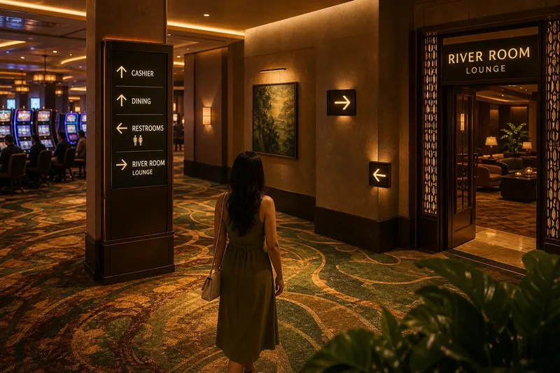
Casino wayfinding gets harder when every instruction competes for attention. A guest approaching a lounge entrance may see arrows for the cashier, restrooms, dining, and an event room before knowing which choice matters now. More signs can mean more reading, not more clarity.
In a casino setting, this matters because guests are moving among distinct experiences: gaming areas, lounges, dining rooms, performance spaces, and service points. The useful question is not whether every destination appears on every sign. It is whether the right information appears where a guest must make a decision.
Decisions, Not Destinations
A sign should answer the question a person has at that location. At a corridor entrance, that may be “Which branch leads to the lounge?” Near a lounge door, it may be “Is this the entrance?” Farther inside, a small marker can confirm the destination without repeating the full directory.
Grouping information by decision creates a simple sequence:
- Orient: Show the main destinations available from a shared point.
- Choose: Mark the turn or route that separates those destinations.
- Confirm: Identify the destination at or near its entrance.
This sequence resembles labels on a drawer unit: one label tells you which drawer to open, while the contents inside do not need to be listed on every nearby surface. A guest benefits from the same restraint. The sign supplies enough context for the next choice, then lets the space provide confirmation.
Why Signs Compete
Every additional message claims some share of attention. A directional arrow, a promotional display, a room name, and a decorative graphic can all be legible on their own yet hard to sort when viewed together. The problem is often not poor lettering; it is that several messages appear to answer different questions at once.
Competition also comes from placement. A large event poster close to a small restroom arrow can pull the eye away from the practical direction. A sign mounted after the turn may offer accurate information too late to help. Repeating an instruction at every wall can make the route feel noisy and leave guests unsure which message is authoritative.
Visual order depends on hierarchy: which message matters first, which can wait, and which belongs somewhere else. A directional sign should not have to share equal prominence with a menu, a promotion, and a room description if the immediate task is choosing a corridor.
Build a Clear Sequence
Start by identifying the decisions guests make along a route, rather than collecting every phrase the venue might want to display. Walk the route from the guest’s point of view and note where a person can actually choose between paths. A long, straight corridor may need little direction; a junction with two similar entrances deserves clearer guidance.
Then sort the information into a few practical groups:
- Direction: arrows, destination names, and route choices.
- Identification: names at doors, desks, or room entrances.
- Context: opening information, event details, menus, or service notices.
- Promotion: invitations to shows, dining, or other venue experiences.
Keep those groups from crowding the same decision point. A directional panel can carry the route information, while a display near the lounge can explain its entertainment schedule. Guests who are choosing where to go need not parse the schedule before finding the entrance.
Say a guest arriving from a gaming floor wants the restrooms and a lounge. Imagine the venue replaces several repeated wall signs with one directory at the corridor fork, two arrows at the turn, and clear names at the two entrances. The expected observable result is that each sign answers a different question: what is available, which way to go, and whether the guest has arrived.
Details That Change Readability
Grouping messages does not mean stripping away useful detail. It means giving each detail a suitable place. Words should be concise enough to scan, and destination names should match the language used by staff and on maps. If a lounge is called “River Room” on a directory but “Riverside Lounge” on the door, a guest has to decide whether those names refer to the same place.
Contrast and lighting matter, too. A pale arrow on a patterned background may disappear in a dim passage, while a glossy sign can reflect overhead lights. Materials, finishes, and illumination should support legibility from the route guests actually use. The sign’s visual style can still belong to the venue; it simply should not make the message harder to distinguish.
Language choice deserves similar care. In a multilingual venue, translating every sentence onto every panel can create dense blocks of text. Grouping by decision helps determine which directions need to appear together and which contextual details can live on a separate notice. Symbols may assist, but they should complement familiar destination names rather than force guests to guess.
When Should a Sign Repeat?
Should every destination appear at each junction?
No. Show the destinations that help a person choose among the routes available at that junction. A destination that lies straight ahead may need confirmation later, but listing it on every nearby surface can add clutter without changing the decision.
When is repeating a direction useful?
Repeat it when the route has a meaningful transition, such as a turn, a change of level, or a point where the destination could be missed. The repeat should confirm the next action, not reproduce a full directory without a reason.
Where should event information go?
Place schedules and descriptions where guests can pause to consider them, such as outside an entertainment room or near a lounge entrance. Keep them separate from signs that direct moving guests through a corridor.
How can staff tell whether a sign is unclear?
Pay attention to ordinary moments: guests stopping at a junction, turning back, or asking where a named room is. Those observations can point to a missing decision cue or mismatched destination name; they do not automatically mean that more signs are needed.
Refine Before Adding
When a route feels confusing, first ask whether the existing message is placed at the right decision point, uses the same name as the destination, and stands out from nearby displays. Moving or clarifying one sign may address the problem more cleanly than adding another instruction beside it.
For Casino Bình Phước, signage can support the venue’s cultural character without turning every surface into a notice board. A restrained hierarchy gives the casino room for its entertainment, hospitality, and visual identity while helping guests understand where to go. Good casino wayfinding is not a count of signs; it is a sequence of clear choices, with each message doing one useful job.